Loading...
The InputBox enables you, like the TextBox, to enter text and retrieve the string for further use with the respective member or node.

To create an InputBox widget choose "Widgets > InputBox". The mouse cursor changes to a crosshairs icon, indicating the create mode. Each left-click adds the selected widget to the current page. To quit the create mode, you can switch to the run mode with [F8], where you can use all widgets. Most widgets however need to be set up first.
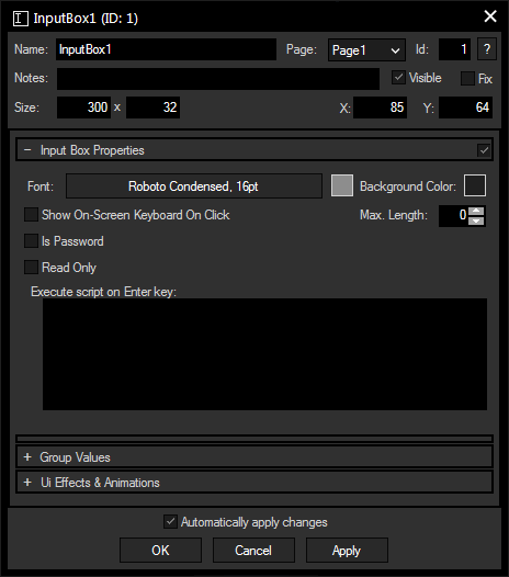
To edit the InputBox properties simply right-click it and choose the first menu entry "InputBox Properties". Alternatively, you can press [Alt + P] whilst the mouse is hovering above it or switch to the edit / move mode with [F9] and double-click on it. The InputBox property dialog opens up.

A unique name can be entered to identify the widget via the Object and Member Notation. The default name is based on the widget type and ID.
This drop-down offers all available pages to place the widget on.
ID:
The InputBox' ID may be changed by entering a new one in the text field top left. If you change it, you will be asked if you also want to adapt the name to the new ID.
A short note can be added here. It is not displayed outside the widget but can be set and retrieved with the WidgetID.Note property member.
Uncheck this box to hide the widget.
Fix:
When the option "Fix" is checked, the InputBox will be displayed on every page.
Enter a pixel size for the InputBox' size.
Enter the location of the widget (upper left corner) in pixels
Font:
Edit the InputBox text font and the font size by clicking on the button with the current font.
To change the text color click in the small box on the right side.
Background Color:
Click the box to open a color picker dialog for the background color.
Check this box to open the integrated on-screen keyboard as soon as a click is performed inside the InputBox. This is especially useful for touch applications such as tablet PCs or touch monitors.
This check box turns all entered characters to dot characters.
Check this box to prevent the InputBox text from being changed manually. Changing the text per script is still possible.
Enter the maximum length of the entered character string. "0" stands for an infinite number of characters.
Enter a script that will be executed when the [Enter] key is pressed. Functions and Macros are a good option to manage large and sophisticated scripts.
This option is only available for the Unlimited version and offers the possibility to assign a group. Please refer to the chapter Group Values for more information.
The topic Effects & Animations explains how to add and apply CSS based effects and animations.