Loading...
The Label control lets you add text labels to your user interface.
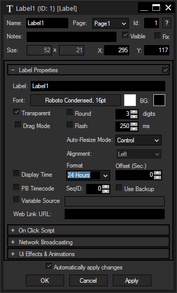
 To edit the Label properties simply right-click it and choose the first menu entry "Label Properties". Alternatively, you can press [Alt + P] whilst the mouse is hovering above it or switch to the edit / move mode with [F9] and double-click on it. The Label property dialog opens up. |

A unique name can be entered to identify the widget via the Object and Member Notation. The default name is based on the widget type and ID.
This drop-down offers all available pages to place the widget on.
ID:
The Label's ID may be changed by entering a new one in the text field top left. If you change it, you will be asked if you also want to adapt the name to the new ID.
A short note can be added here. It is not displayed outside the widget but can be set and retrieved with the WidgetID.Note property member.
Uncheck this box to hide the widget.
Fix:
When the option "Fix" is checked, the Label will be displayed on every page.
Enter a pixel size for the Label's size.
Enter the location of the widget (upper left corner) in pixels
Label:
Edit the Label text by entering it in the text field.
Font:
Edit the Label font and the font size by clicking on the button with the current font.
To change the Label text color click in the small box on the right side.
BG:
The background color is transparent by default. If you want to underlay the text with a color, uncheck "Transparent" and choose a color for the background by clicking in the small box.
Check this box if you want to display floating point values with a reduced amount of digits. Enter the desired amount of digits in the field at the right.
Flash:
When this option "Flash" is checked, the Label will flash (visible / not visible). The flash interval time is set to 250 ms by default. To increase or decrease the flashing interval time, change the value here or use the command WDLabelFlashInterval(ID,Value).
Choose here one out of three modes to correlate the widget's size and the font:
Disabled: The size of the widget is adjustable, the text will not be adjusted automatically. Text that overlaps the borders will not be displayed.
Font: The font will be adjusted automatically to the widget's size so that the text always fits in.
Control: The widget's size will follow the text, it cannot be adjusted manually except by setting the font size.
The options "Disabled" and "Font" also offer the possibility to set the text alignment within the widget to "Left", "Center" and "Right".
Choose this option to display the local computer's time, either in the "24 Hours" or in the "AM/PM" format. An offset can also be set if necessary.
If a Pandoras Box is connected, the Label can be used to display the timecode of a sequence. Specify the Sequence ID in the respective field and check "Use Backup" if you need to backup machine's timecode instead of the main machine. Please see also the dialog PB Network Configuration.
Variable Source:
If the value of a variable should be displayed as Label text, check the option "Variable Source" and enter the name of the variable. If the variable's value is going to be updated, the Label text will be updated as well.
If one of the options "Display Time", "PB Timecode" or "Variable Source" is checked, the Label's text adopts to the according options and since versions 6.5.3 the property "Label1.Text" does too.
The Web Link section is of special interest when working with the Web Server feature, i.e. clicking the Label in a web browser. Enter a URL e.g. "https://www.christiepandorasbox.com" that your browser should call when executing the On Click Script.
It is also possible to achieve a quick page change with the URL, simply enter a hash tag "#" and the page name. E.g.: #Page2
Check the option "Open In New Tab" if you would like to keep the Widget Designer page loaded in your browser.
Enter a script that will be executed when clicking on the Label. Functions and Macros are a good option to manage large and sophisticated scripts.
The NBS (Network Broadcast Service) allows to transmit and update Faders, Labels and Custom Script Buttons across multiple WD Designers instances on the network.
To activate this service, please refer to the Remoting Menu!
Enable Send:
To send the Label values as broadcast into the network, you only have to check "Enable Send".
Enable Receive:
To receive values from other Faders, Labels or Custom Script buttons, please check "Enable Receive".
Now you have to specify which item should update your Label:
Enter the IP address of the computer you want to listen to. This could be the local computer (to control the fader through another item on the same Widget Designer) or a different computer in the network. If you do not want to specify the computer but want to listen to all computers in the network, enter "255.255.255.255".
As next step specify the item you want to take the values from. This could be a Fader (e.g. "Fader1" or "Fader2"), a Label (e.g. "Label1" or "Label2"), or a Custom Script Button (e.g. "CustomScript1" or "CustomScript2" – you will be able get its status: 1/0).
This option is only available for the Unlimited version and offers the possibility to assign a group. Please refer to the chapter Group Values for more information.
The topic Effects & Animations explains how to add and apply CSS based effects and animations.
 As explained above, Labels can have an "On Click Script" to execute commands. To apply a button-like look to those Labels to enhance the user experience, you can use the CSS style "LabelButton" explicitly written for Labels. As shown below, you can, for example, customize a background and border color, and the look when the mouse hovers over the Label. To apply the style, click the "Add" button in the section "Ui Effects & Animations", choose "Design\LabelButton" from the new drop-down list and press the "Apply" button at the bottom. Before editing the style, please make sure that WD is in Run Mode to render the CSS style. As you see, the text in the Label is cut off because the style added some padding. To correct this, please open the section "Label Properties" and set the "Auto-Resize Mode" to "Disabled". Now you can change the Label's size manually according to your text, font size and padding options. |
|
As seen in the depicted examples, many different looks can be achieved. There are many websites available to learn CSS, "w3 schools" for instance, offers tutorials for beginners as well as additional information on expressions for advanced users: http://www.w3schools.com/css/ The chapter Effects & Animations provides more information about this topic. |