Loading...
Shapes can be used for highlighting elements in the user interface, to group widgets, to subdivide areas or simply as a decorative item.

To create a Shape widget choose "Widgets > Shapes > Ellipse or or Line horizontal / vertical or Rectangle or Rounded Rectangle". The mouse cursor changes to a crosshairs icon, indicating the create mode. Each left-click adds the selected widget to the current page. To quit the create mode, you can switch to the run mode with [F8], where you can use all widgets.
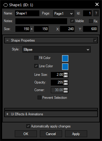
To edit the Shape properties simply right-click it and choose the first menu entry "Shape Properties". Alternatively, you can press [Alt + P] whilst the mouse is hovering above it or switch to the edit / move mode with [F9] and double-click on it. The Shape property dialog opens up.

A unique name can be entered to identify the widget via the Object and Member Notation. The default name is based on the widget type and ID.
This drop-down offers all available pages to place the widget on.
ID:
The Shape's ID may be changed by entering a new one in the text field top left. If you change it, you will be asked if you also want to adapt the name to the new ID.
A short note can be added here. It is not displayed outside the widget but can be set and retrieved with the WidgetID.Note property member.
Uncheck this box to hide the widget.
Fix:
When the option "Fix" is checked, the Shape will be displayed on every page.
Enter a pixel size for the Shape's size.
Enter the location of the widget (upper left corner) in pixels
You can choose one out of three designs: ellipse, rectangle and rounded rectangle
Check this box to activate the fill color, a color picker for changing the hue will open when you click on the small box on the right.
Check this box to activate the line color, a color picker for changing the hue will open when you click on the small box on the right.
Enter here the thickness of the outline in pixels.
Enter the transparency for the widget, "255" equals not transparent at all while "0" means completely transparent.
This parameter is only available for rounded rectangle Shapes and specifies the rotundity of the corners. A value of "0" would be a straight rectangle, increasing the value leads to more rounded corners.
Check this box to avoid selecting the widget. It then can't be selected when in moving mode, except with a right-click directly on the Shape. Ticking this box also has the effect that the Shape's Z-position is being sent to the back.
The topic Effects & Animations explains how to add and apply CSS based effects and animations.