Loading...
The CheckBox widget is a control that can be used to indicate on/off (or undetermined) states. The state can be either set in the user interface or via commands.
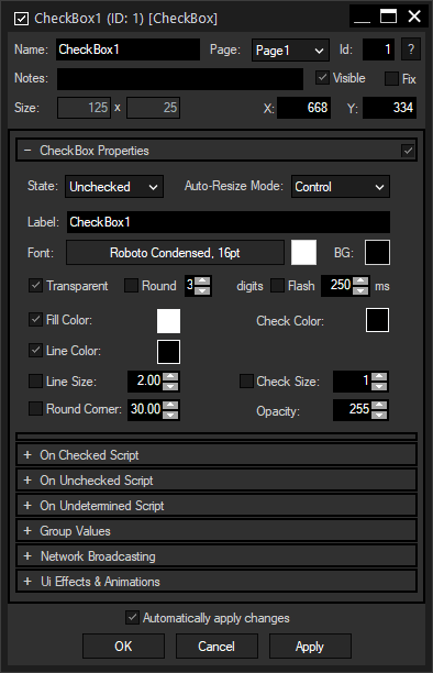
To edit the CheckBox properties simply right-click it and choose the first menu entry "CheckBox Properties". Alternatively, you can press [Alt + P] whilst the mouse is hovering above it or switch to the edit / move mode with [F9] and double-click on it. The CheckBox property dialog opens up. |
 A unique name can be entered to identify the widget via the Object and Member Notation. The default name is based on the widget type and ID. Page:This drop-down offers all available pages to place the widget on. ID: Notes:A short note can be added here. It is not displayed outside the widget but can be set and retrieved with the WidgetID.Note property member. Visible:Uncheck this box to hide the widget. Fix: Size:Enter a pixel size for the widget's size. X and Y:Enter the location of the widget (upper left corner) in pixels. |
Instead of ticking the CheckBox in the use interface, you can set the state here: Checked, Unchecked. The "Undetermined" state can only be chosen using this properties dialog, via a command, e.g. WDCheckBoxSetState, or the CheckBox Output node. There is also an CheckBox Input node available to use the state value in the node system.
Choose here one out of three modes to correlate the widget's size and the font:
Disabled: The size of the widget is adjustable, the text will not be adjusted automatically.
Font: The font will be adjusted automatically to the widget's size so that the text always fits in.
Control: The widget's size will follow the text, it cannot be adjusted manually except by setting the font size.
Label:
Edit the text that labels the CheckBox.
Font:
Edit the Label font and the font size by clicking on the button with the current font.
To change the Label text color click in the small box on the right side.
BG, Transparent:
The background color is transparent by default. If you want to underlay the text with a color, uncheck "Transparent" and choose a color for the background by clicking in the small box.
Check this option if you want to display floating point values with a reduced amount of digits. Enter the desired amount of digits in the field at the right.
Flash:
When this option "Flash" is checked, the Label will flash (visible / not visible) according to the flash interval time in ms.
Check this option to activate the fill color of the box. A color picker for changing the hue will open when you click on the small box on the right.
Check this option to activate the line color of the box. A color picker for changing the hue will open when you click on the small box on the right.
Check this option to overwrite the thickness of the outline with a given number in pixels. When unchecked, the Line Size will scale automatically when the widget is scaled ("Auto-Resize Mode" = "Font").
Check this option to influence the radius of (rounded) corners of the box (property "Line Size"). A value of "0" results in right angles; increasing the value leads to more rounded corners.
This sets the color of the check mark. A color picker for changing the hue will open when you click on the small box on the right.
Check this option to overwrite the size of the check mark. When unchecked, the Check Size will scale automatically when the widget is scaled ("Auto-Resize Mode" = "Font").
Enter the transparency value for the box. "255" equals completely opaque and "0" completely transparent.
In the Script section you may enter commands to be executed. You can type directly in the text field, the Script Assistant will help you finding the expression you search for. The topic Script Language explains this in more detail.
The scripts for the states "Checked", "Unchecked" or "Undetermined" are executed when the CheckBox state is changed in the local interface as well as in any web client.
You can enter as much text in one of the scripting fields as you like. For sophisticated scripts, Macros and Functions allow you to keep a good overview.
If you are interested in the Web Server feature and some small examples, please read the topics Web Server and Object and Member Notation.
See here a list of all commands.
This option is only available for the Unlimited version and offers the possibility to assign a group. Please refer to the chapter Group Values for more information.
This feature is currently not implemented.
The topic Effects & Animations explains how to add and apply CSS based effects and animations.
Please see here a small example how to link "sub" CheckBoxes with a "main" CheckBox using the script language.

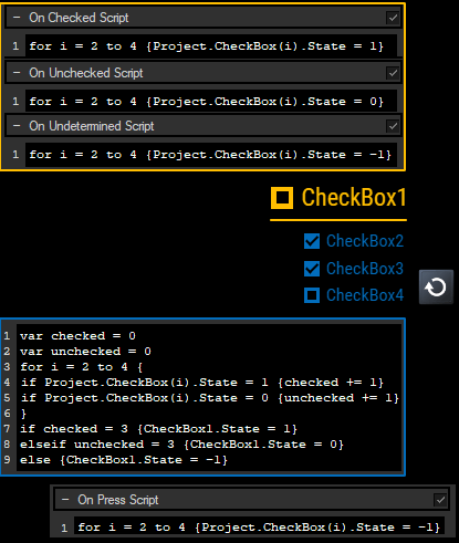
The yellow CheckBox includes a script for each state which uses a for loop to set all blue sub CheckBoxes to the according state: 1 = "Checked", 0 = "Unchecked", -1 = "Undetermined". The Project object is used to substitute the ID of the CheckBox with the iterating variable "i", this is explained in more detail in the chapter "Project and Context Member".
For the sub CheckBoxes, there are various solutions. The blue outlined script counts how many boxes are checked and unchecked by increasing the according local variable.
Next, an if-statement (or switch/case-statement if preferred) checks those variables and in case the state for all sub boxes is "Checked", respectively "Unchecked, the main box is set accordingly. For all other cases, such as the depicted one, it is set to "Undetermined".
The whole script could now be copied to all three scripts fields from all sub CheckBoxes. A more dynamic approach of course would be, to use it in a Macro and all script fields contain the command to call it (WDMacro(Name) or just the name). Thirdly, you could leave those script fields empty and use an Action node instead. It executes the script any time one of the sub CheckBoxes changes its state.
Lastly, an optional "Reset" button sets the state of all sub boxes (and thus main box) to "Undetermined".