Loading...
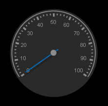
The Gauge allows showing any numeric value that is routed to the Gauge Output Node.

To create a Gauge widget choose "Widgets > Displays > Gauge". The mouse cursor changes to a crosshairs icon, indicating the create mode. Each left-click adds the selected widget to the current page. To quit the create mode, you can switch to the run mode with [F8], where you can use all widgets. Most widgets however need to be set up first.
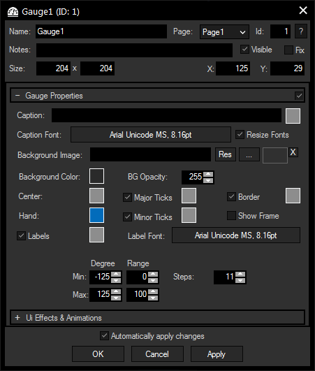
To edit the Gauge properties simply right-click it and choose the first menu entry "Gauge Properties". Alternatively, you can press [Alt + P] whilst the mouse is hovering above it or switch to the edit / move mode with [F9] and double-click on it. The Gauge Property dialog opens up.

A unique name can be entered to identify the widget via the Object and Member Notation. The default name is based on the widget type and ID.
This drop-down offers all available pages to place the widget on.
ID:
The Gauge's ID may be changed by entering a new one in the text field top left. If you change it, you will be asked if you also want to adapt the name to the new ID.
A short note can be added here. It is not displayed outside the widget but can be set and retrieved with the WidgetID.Note property member.
Uncheck this box to hide the widget.
Fix:
When the option "Fix" is checked, the Gauge will be displayed on every page.
Enter a pixel size for the Gauge's size.
Enter the location of the widget (upper left corner) in pixels
Here, you can enter a label for the display, color and font can be selected with the respective buttons.
This features adjusts the fonts of caption and numbers when changing the size of the widget.
An image can be loaded as a background. You can either browse your system for a picture or choose one out of the Resource Manager. Animated GIFS are currently not supported.
It is also possible to set a background color and transparency.
You may design your Gauge using different colors for Center, Hand, Label, Major Ticks, Minor Ticks and Border.
Tick the check boxes to hide / display the mentioned units. A decorative frame can be displayed as well.
Set Min and Max for Degree and Range to change the Gauge's size and range. Enter the amount of steps for your range.
The topic Effects & Animations explains how to add and apply CSS based effects and animations.