Loading...
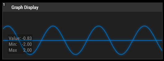
The GraphDisplay allows showing the graphical procession of a value over time that is routed to the Graph Display Output Node.

To create a GraphDisplay widget choose "Widgets > Displays > GraphDisplay". The mouse cursor changes to a crosshairs icon, indicating the create mode. Each left-click adds the selected widget to the current page. To quit the create mode, you can switch to the run mode with [F8], where you can use all widgets. Most widgets however need to be set up first.
To edit the GraphDisplay properties simply right-click it and choose the first menu entry "GraphDisplay Properties". Alternatively, you can press [Alt + P] whilst the mouse is hovering above it or switch to the edit / move mode with [F9] and double-click on it. The GraphDisplay Property dialog opens up.

A unique name can be entered to identify the widget via the Object and Member Notation. The default name is based on the widget type and ID.
This drop-down offers all available pages to place the widget on.
ID:
The BarGraph's ID may be changed by entering a new one in the text field top left. If you change it, you will be asked if you also want to adapt the name to the new ID.
A short note can be added here. It is not displayed outside the widget but can be set and retrieved with the WidgetID.Note property member.
Uncheck this box to hide the widget.
Fix:
When the option "Fix" is checked, the BarGraph will be displayed on every page.
Enter a pixel size for the BarGraph's size.
Enter the location of the widget (upper left corner) in pixels
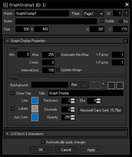
Set the value range for incoming data using Max and Min. If you checked "Automatic Min/Max", those values are automatically to the incoming values.
Set here a factor to adjust the coordinate system by compressing or stretching the graph.
Enter here an offset for your X-axis.
If you check "Update Always", the graph is being constantly updated within the given interval. Otherwise, it will only be updated on value change.
An image can be loaded as a background. You can either browse your system for a picture or choose one out of the Resource Manager. Additionally, you can define two different colors for a background gradient by clicking on the two far right color buttons.
Enter here a title that is displayed at the top of the GraphDisplay. Uncheck the box "Show Title" if you want to remove the title bar.
The labels show the the current value as well as Min and Max. Check the box on the left to show the data and set color and font with the respective buttons. Adjust the exactness of the displayed values with the Decimal field.
Customize your GraphDisplay design by adjusting the Line Color and Thickness, the amount of Blur for the line and the Axis Color, as well as the Opacity of the graph.
The topic Effects & Animations explains how to add and apply CSS based effects and animations.