Loading...
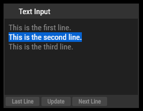
The TextInput control lets you add an editable text to remote control text assets within Pandoras Box.
Depending on the configuration of the TextInput control you may update dedicated text assets by clicking on the Last Line and Next Line button. This way you may continuously update text assets line by line or update the entire TextInput contents to the text asset on all connected Pandoras Box Client systems.

To create a TextInput widget choose "Widgets > TextInput". The mouse cursor changes to a crosshairs icon, indicating the create mode. Each left-click adds the selected widget to the current page. To quit the create mode, you can switch to the run mode with [F8], where you can use all widgets.
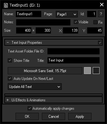
To edit the TextInput properties simply right-click it and choose the first menu entry "TextInput Properties". Alternatively, you can press [Alt + P] whilst the mouse is hovering above it or switch to the edit / move mode with [F9] and double-click on it. The TextInput property dialog opens up.

A unique name can be entered to identify the widget via the Object and Member Notation. The default name is based on the widget type and ID.
This drop-down offers all available pages to place the widget on.
ID:
The TextInput's ID may be changed by entering a new one in the text field top left. If you change it, you will be asked if you also want to adapt the name to the new ID.
A short note can be added here. It is not displayed outside the widget but can be set and retrieved with the WidgetID.Note property member.
Uncheck this box to hide the widget.
Fix:
When the option "Fix" is checked, the TextInput will be displayed on every page.
Enter a pixel size for the TextInput's size.
Enter the location of the widget (upper left corner) in pixels
Text Asset FolderID.FileID:
Define one or multiple Text Assets in PB this Text Input should be linked to. To do this please enter the Folder and File IDs.
Example:
To assign the Text Input to PB Text Asset 1.1 and 1.2, enter: "1.1 1.2".
Enter here a title that is displayed at the top of the TextInput. Uncheck the box "Show Title" if you want to remove the title bar.
Font:
Edit the TextInput text font and the font size by clicking on the button with the current font.
To change the text color click in the small box on the right, to change the background color click on the far right button.
Auto Update On Next/Last:
This option will send text contents directly upon button press.
Update Selected Line / Update All Text:
Choose between these two options to update only by line or complete text. If the "Update Selected Line" mode is active, only the line highlighted in blue will be sent.
The topic Effects & Animations explains how to add and apply CSS based effects and animations.